Evaluating the Utility of Multiple Workspaces and Easy Chart Creation for Visual Analytics Inproceedings
Swaroop Panda, Wolfgang Stuerzlinger
Abstract:
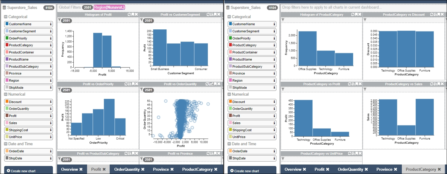
Visual Analytics involves interactive visual exploration of data sets. Interaction methods allow data analysts to explore different aspects and investigate various hypotheses. This work investigates if chart creation and multiple tabs enable analysts to pursue multiple hypotheses or analysis paths better than other approaches. To evaluate this, new features were added to an existing Visual Analytics prototype with a multi-tab design. Two user studies with professional data analysts confirmed the utility of our approach within the Visual Analytics process. Analysts can easily work within multiple workspaces, enabling them to frame and track multiple hypotheses about the data and pursue different exploratory analysis paths, ultimately yielding more comprehensive analysis outcomes.