MACE: A New Interface for Comparing and Editing of Multiple Alternative Documents for Generative Design Inproceedings
Loutfouz Zaman, Wolfgang Stuerzlinger, Christian Neugebauer
Abstract:
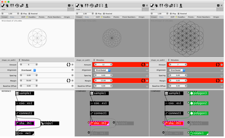
We present a new interface for interactive comparisons of more than two alternative documents in the context of a generative design system that uses generative data-flow networks defined via directed acyclic graphs. To better show differences between such networks, we emphasize added, deleted, (un)changed nodes and edges. We emphasize differences in the output as well as parameters using highlighting and enable post-hoc merging of the state of a parameter across a selected set of alternatives. To minimize visual clutter, we introduce new difference visualizations for selected nodes and alternatives using additive and subtractive encodings, which improve readability and keep visual clutter low. We analyzed similarities in networks from a set of alternative designs produced by architecture students and found that the number of similarities outweighs the differences, which motivates use of subtractive encoding. We ran a user study to evaluate the two main proposed difference visualization encodings and found that they are equally effective.
